Concept

UI

UX

Oyster App
Redesign Concept

Overview

Overview

The TfL Oyster app supports millions of journeys around London every day, and is often used in high-pressure, low-attention moments - at barriers, on platforms, or while walking. This personal project explores how simplifying navigation and prioritising core actions can reduce friction and improve user experience.
Thousands of people rely on their Oyster card every day, but managing accounts digitally is still a frustrating experience. From checking balances to topping up, the current app introduces unnecessary friction through poor navigation and unclear user flows. This concept project demonstrates my UX/UI process from end-to-end, starting at user interviews which I conducted in London, through to analysis and ideation, and culminating in detailed designs and prototypes, created in Figma.
Overview
The existing Oyster app offers a range of features to help customers engage with their account, such as topping up their card and purchasing season tickets - but struggles to surface the features users rely on most. Reaching information such as journey history is hidden behind multiple taps, a navigation is unclear. My primary goals in this project were to reduce confusion in completing core tasks in low-attention contexts, improve visual hierarchy, and align navigation with real-world usage patterns.
User research

User survey

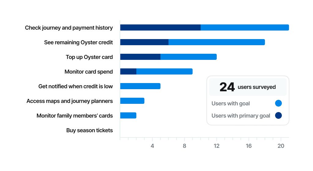
I ran an online survey to understand how and when people use the Oyster app, focusing on primary goals, frequency of use, and pain points. Three usage goals emerged as the clear priority for the majority of users:
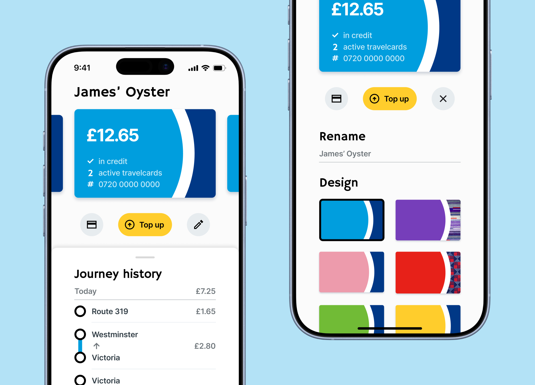
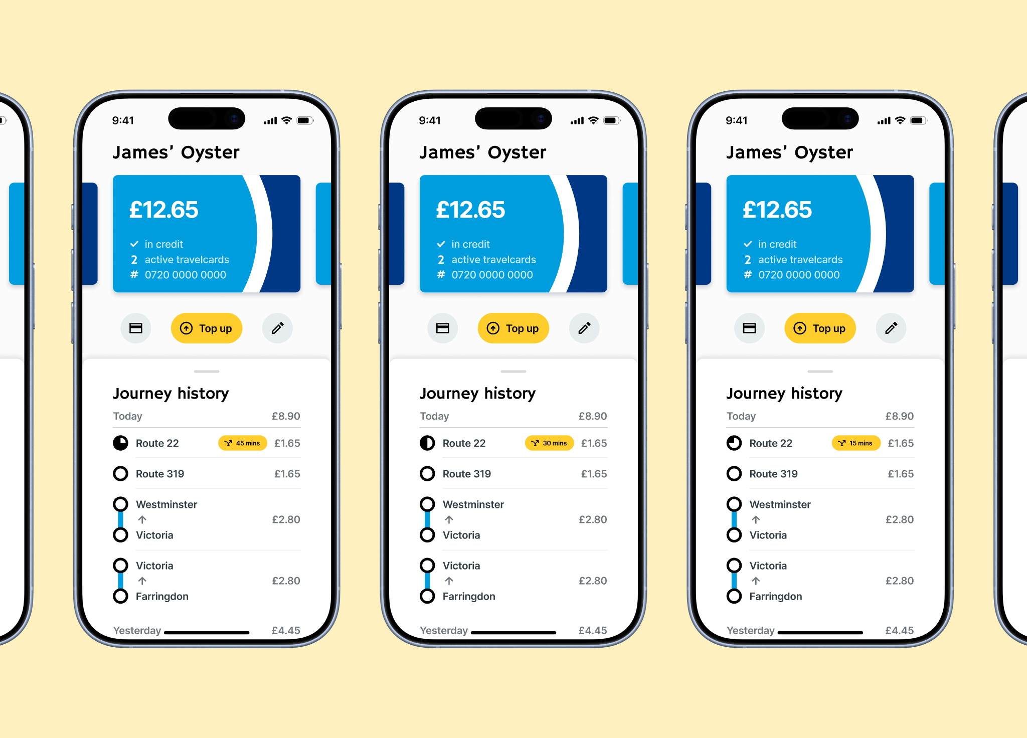
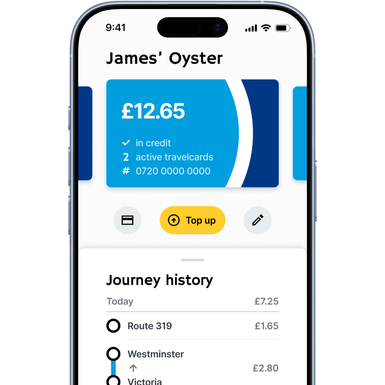
  1. Viewing recent journeys.
  2. Checking card balances.
  3. Topping up a card.
Secondary features, such as buying season tickets, were used infrequently but compete for attention on the home screen with the same prominence as primary features, creating unnecessary friction for high-frequency tasks.
Insight: The existing navigation system is not optimised for real user intents.

“What features do you primarily use the Oyster card app for?”

Usability testing

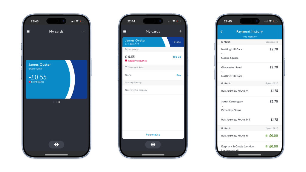
To understand how commuters used the app, I challenged four members of the public at South Kensington tube station to complete the three core goals (view journey history, check card balance, top up card) using the Oyster app. This allowed me to observe several key issues across all journey flows:
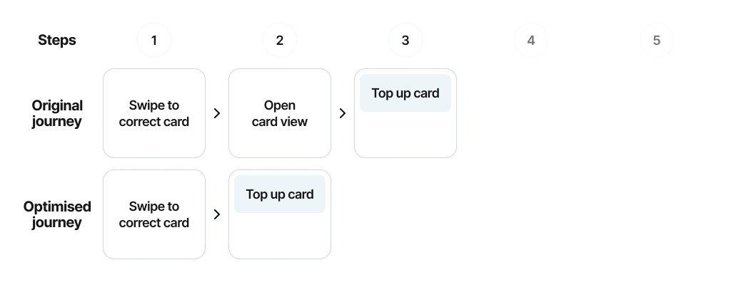
  1. Users frequently struggled to find the correct entry point (especially for topping up or checking journey history), despite there often being multiple routes through the app to reach the desired goal.
  2. Certain UI elements, such as the main card element, were often assumed not to be clickable or swipable due to lack of affordances.
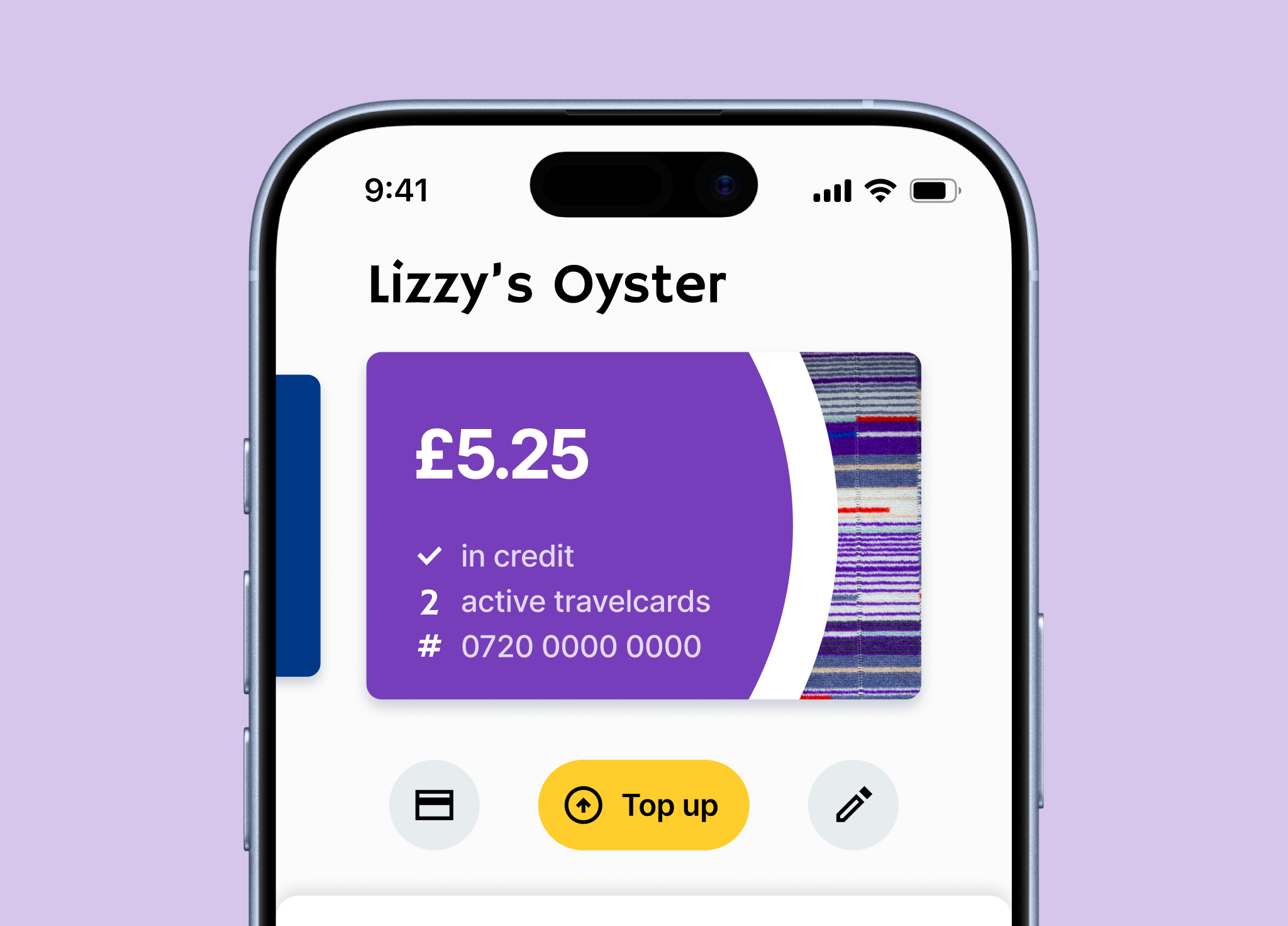
  3. Lack of visual cues on the cards made them hard to distinguish, leading to confusion over which card was being viewed.
  4. Small text led some users to miss buttons or key information.
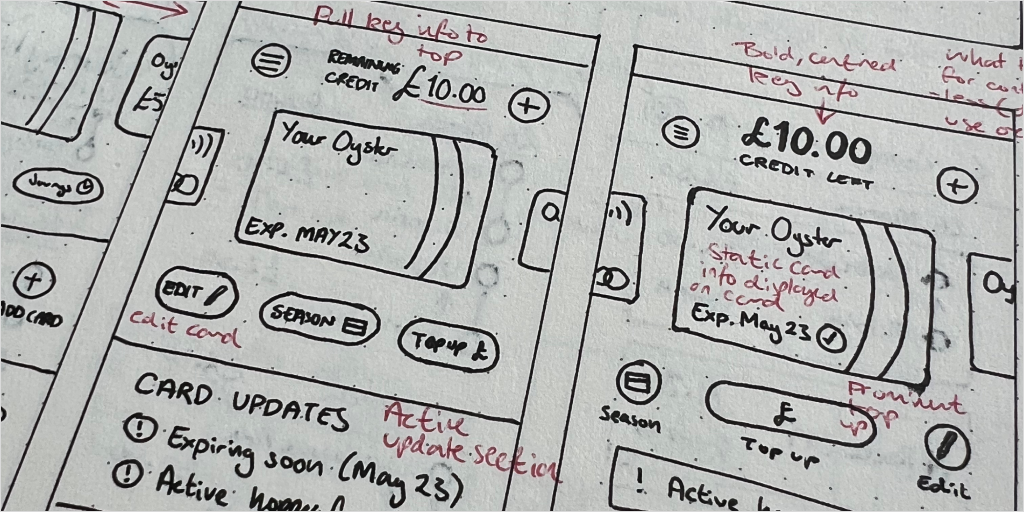
Insight: The abnormal layout forced users to move through several complex menus to achieve simple tasks. Compounded by small text and unclear navigation, this led to missed affordances and unnecessary friction completing routine tasks - highlighting a misalignment between interface hierarchy and user intent.
Ideation
This research helps arrive at the key problem statement: “How can I enable Oyster users to access essential information and actions quickly and confidently, even when distracted or on the move?”
To solve this, I rapidly ideated through methods such as Crazy Eights. I focused my design exploration on four principles:
  1. Card balance should be immediately visible.
  2. Top-up should be a single, obvious action.
  3. Journey history should be accessible and readable at a glance.
  4. Navigation should reflect frequency of use.

Navigation redesign

A card sort exercise revealed that the features users interacted with most were hidden many layers deep in menus, while less frequently used ones were surfaced more prominently. The new navigation model prioritises frequency of use, pushing lower-value features deeper into the hierarchy. Some features became less immediately visible, but core flows became faster and more predictable.

'View journey' flow optimisations

'Top up card' flow optimisations

Final prototypes

Home screen improvements

I redesigned the home screen to surface critical information immediately, removing the need to navigate to find card status or balance. Top-up flow is immediately accessible, with a larger touch target and prominent signposting. Visual cues indicate scrollable content for finding additional cards.
Impact: Steps to top up reduced from 3 to 2.

Journey history & hopper fare indicator

I brought journey history to the fore, making it immediately visible from the home screen. Readability is improved through a new chronological ordering of journeys, and the new hopper timer allows users to see the time remaining on their hopper fare, so they can maximise its usage.
Impact: Steps to view recent journeys reduced from 3 to 2.

Card personalisation

To reduce card-selection errors, I introduced optional card personalisation - particularly helpful for users managing multiple Oyster cards. Cards now sport custom names and designs, which are aligned to real-world Oyster cards to leverage instant recognition.
Impact: Reduced likelihood of incorrect card selection.

Secondary feature page

I consolidated infrequently used or lower-priority features to a single secondary page, reducing competition with primary flows. ‘Add card’ action was surfaced more prominently, and basic journey mapping was improved with an expandable map feature.
Impact: Improved navigation to secondary features.
UI shots
This project reinforced the importance of designing for low-attention environments. At scale, small inefficiencies compound quickly to create poor UX. Future work would include user testing and iteration of the prototypes, accessibility audits, and validation against real-world technical constraints.