Concept

UI

UX

Amazon Business
Retention Page Redesign

Overview

Overview

The TfL Oyster app supports millions of journeys around London every day, and is often used in high-pressure, low-attention moments - at barriers, on platforms, or while walking. This personal project explores how simplifying navigation and prioritising core actions can reduce friction and improve user experience.
Amazon Business provides B2B customers with tools such as business pricing, automated invoicing, and multi-user accounts. One critical point in the customer lifecycle is account deregistration, where users can opt to close their business account and revert to a standard consumer experience. In this project, I focused on optimising a key page within the deregistration journey, with the goal of reducing account closures while maintaining a clear and compliant path for users who still wished to leave. My role was to complete this end-to-end, from conducting the initial research through to Figma designs, prototyping, and implementation on Amazon.co.uk.
Problem
A marketing page had already been introduced into the account closure flow to encourage users to stay, but performance was weak. A high proportion of users continued directly to closure, suggesting the page was not effectively communicating value or influencing behaviour. The main challenges were:
  1. Most users arrived with strong intent to close their account.
  2. Page hierarchy did not prioritise the most compelling benefits of business accounts.
  3. Page content was not sufficient to convince users to stay at this point in the customer journey.
This resulted in 86% of customers progressing to the next stage of the closure journey.
Approach
To understand how to reduce account closures, I first needed to identify what was driving users to this point in the journey, and what levers on the page could realistically influence their decision. I focused the analysis around three key questions:
  1. Why are customers closing their account? Which value propositions or features can be surfaced on the page to counteract those specific reasons?
  2. What type of customers are most likely to deregister? Can the page be better tailored to the customer segments most at risk of churn?
  3. What content on the existing page is already performing well? Which existing interventions are already influencing users to stay, and how can these be prioritised?
To answer these questions, I ran click analysis on the page, queried user data to segment by tenure and business type, and combined these with customer survey data.

Key insights

1. Customers were leaving due to an awareness and value gap
Survey data showed that a lack of strong pricing, rewards, and invoicing features were among the most common reasons customers disengaged from Amazon Business. This suggested that many users either did not know these features existed, or did not fully understand their value.
2. Newer customers were disproportionately likely to deregister
Customers were 3x as likely to deregister in their first year on Amazon Business, indicating that early-tenure users lacked awareness of the platform’s business-specific benefits. This insight shifted the page strategy toward feature discovery, rather than generic retention messaging.
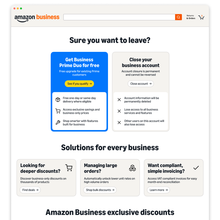
3. Content with immediate value and strong visual hierarchy performed better
Click analysis of the current page showed that a small number of interventions were already successfully diverting users away from closure. Business Prime, the top-performing content module, drove more clicks than all other featured content combined. This suggested that visual prominence, placement, and immediate value were key drivers of interaction. Lower-page modules and generic product recommendations significantly underperformed.
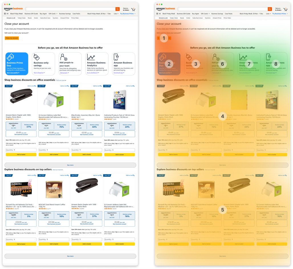
Heatmap overlay (right) showing most commonly clicked areas of the original page design (left). Close account button was by far the most clicked, followed by the Business Prime tile. Recommended product carousels were less popular, followed by the remaining feature tiles which received extremely few clicks.
Solution
Rather than treating this page as a passive step in the closure journey, I reframed it as a deliberate decision point. Users are now presented with a clear choice: continue with account closure, or re-engage with Amazon Business through a free Business Prime trial. This introduces a meaningful trade-off that encourages users to reassess whether closing their account is the best option, while simultaneously addressing the primary user concern around lack of value. Further changes were:
  1. Surfaced more relevant features. I prioritised invoicing features due to their prominence in churn-related feedback.
  2. Prioritised business-specific value drivers. I surfaced bulk purchasing and quantity discounts more prominently, to highlight these unique features that differentiate Amazon Business from the consumer experience.
  3. Improved product relevance and value visibility. I redesigned the product carousel to showcase clear business savings, and added an industry toggle to allow businesses to see more relevant selection - increasing the perceived relevance and impact.
  4. Maintained a clear and accessible closure path. I ensured that the option to close the account remained visible and straightforward, ensuring compliance and preserving user trust.
Impact
To measure performance, I A/B tested the new page in the UK marketplace ahead of full EU rollout. The new UI delivered measurable improvements across the closure journey:

2.7%

reduction in users proceeding to next step

3.3x

more likely to engage with other content on the page

1.2%

decrease in deregistrations vs. EU benchmark

By restructuring account closure as a critical decision point, I was able to redesign the page to influence user behaviour without restricting choice. Working within tight constraints, including limited developer support and a short delivery timeline, meant focusing on changes achievable simply through page layout and messaging rather than new functionality - this allowed me to own the design and implementation of this journey end-to-end. The results reinforced the importance of clear value communication, where surfacing relevant and tangible benefits can meaningfully influence behaviour despite the high-intent nature of this journey. Future iterations could explore more personalised experiences, tailoring messaging and offers based on customer tenure, segment, and usage patterns.