The problem: Customers struggled to find menu items quickly, particularly when browsing menu pages with lots of items. Many didn’t realise the list could be scrolled, meaning items further down were often missed. This led to customers spending a long time interacting with the kiosk, reducing shop throughput.
My solution:
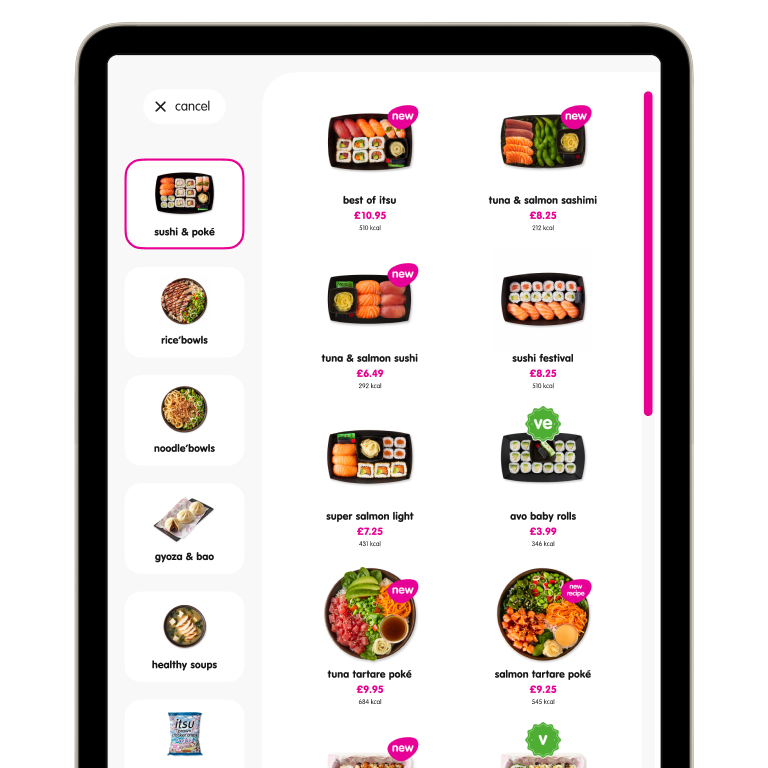
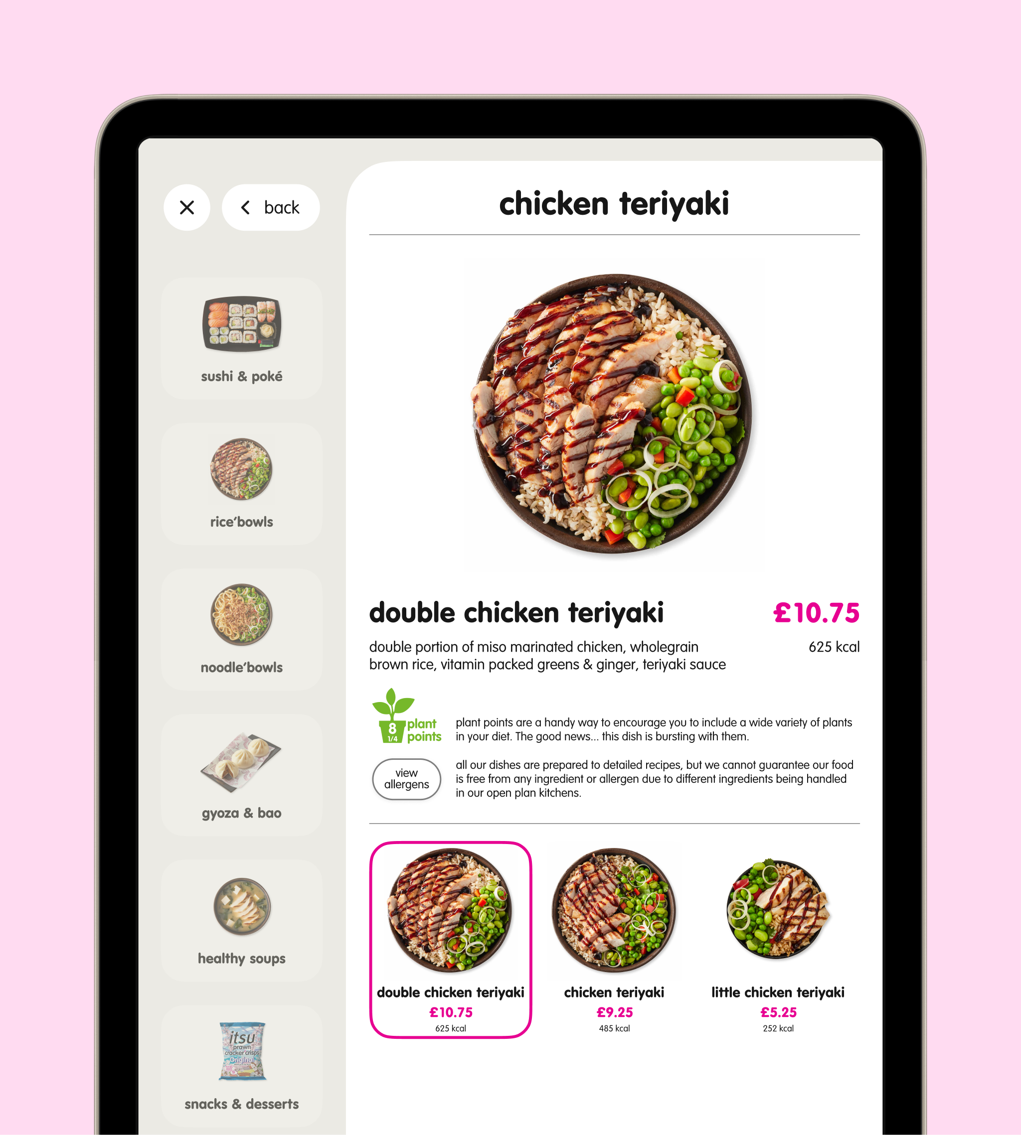
Where scrolling was required, affordances were introduced to make this clearer. Scroll bar thickness was increased, and the grid was resized to allow items to ‘peek’ up from the bottom, suggesting to users that more items lay below the fold.
Introduced nested menu structures to make browsing more intuitive and reduce the need to scroll in the first place.
Reorganised menu categories to prioritise popular items.
Updated the screensaver to reduce steps and streamline the start of the ordering flow.
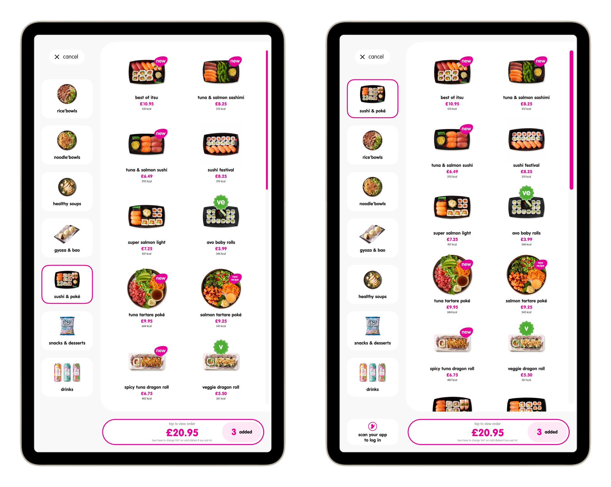
Before (left) and after (right) of a typical menu page. The scroll bar has been widened and grid layout has been amended to aid scrolling. In the left-hand navigation, categories have been reorganised to prioritise more popular menu items.
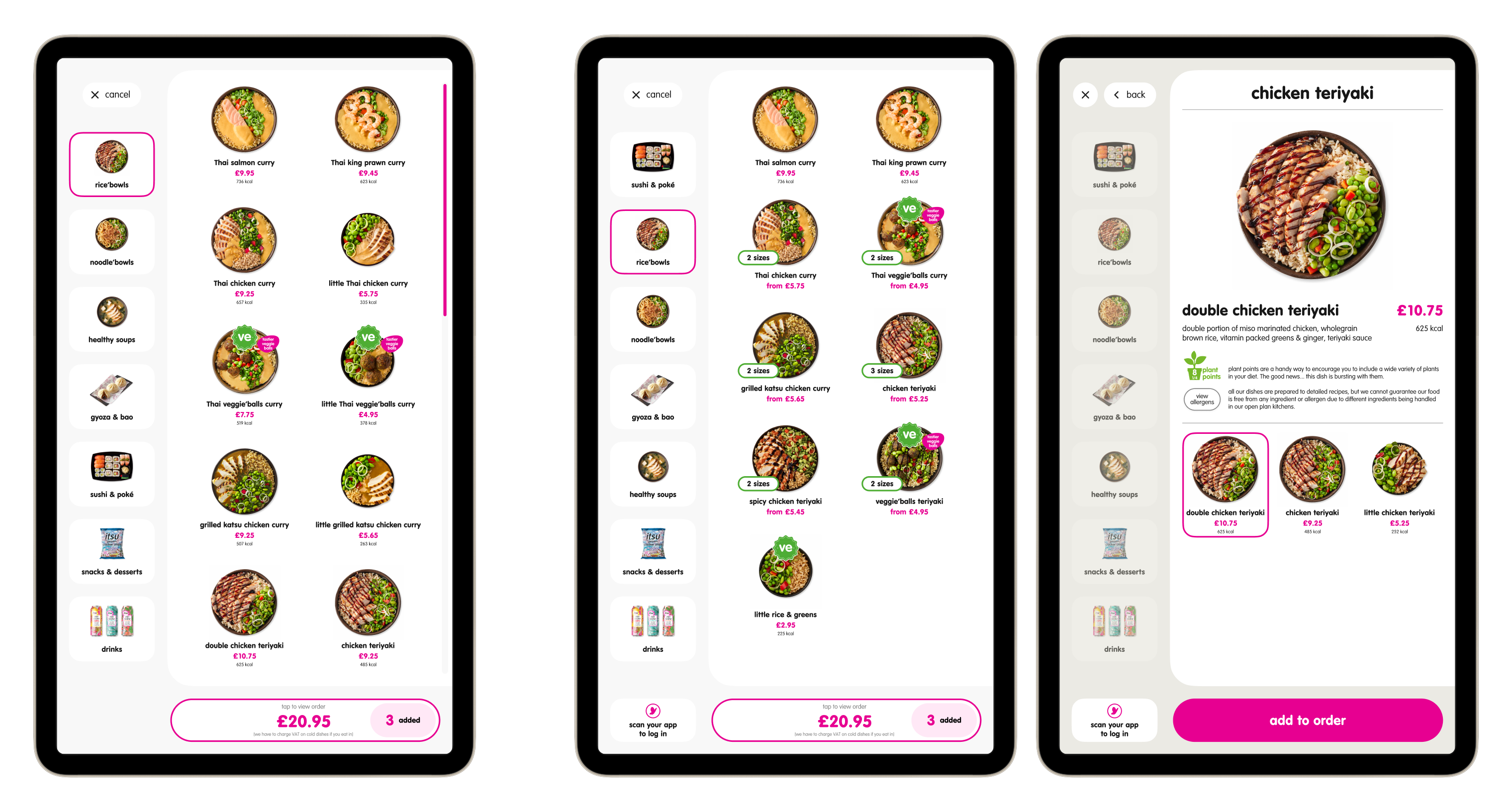
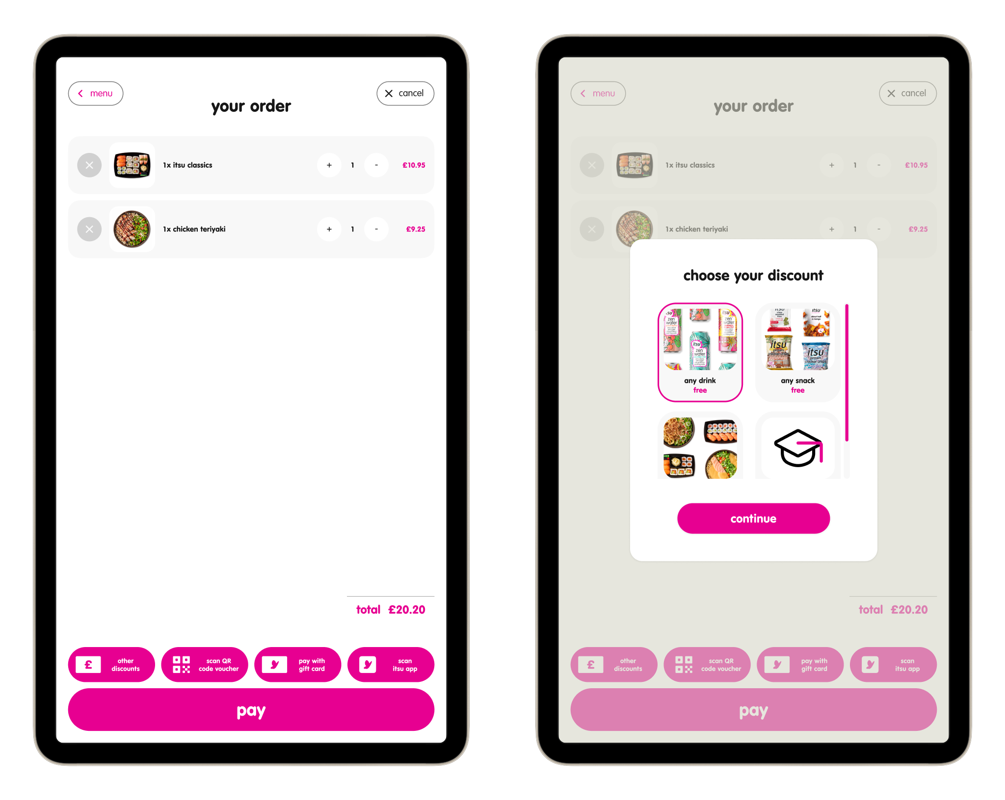
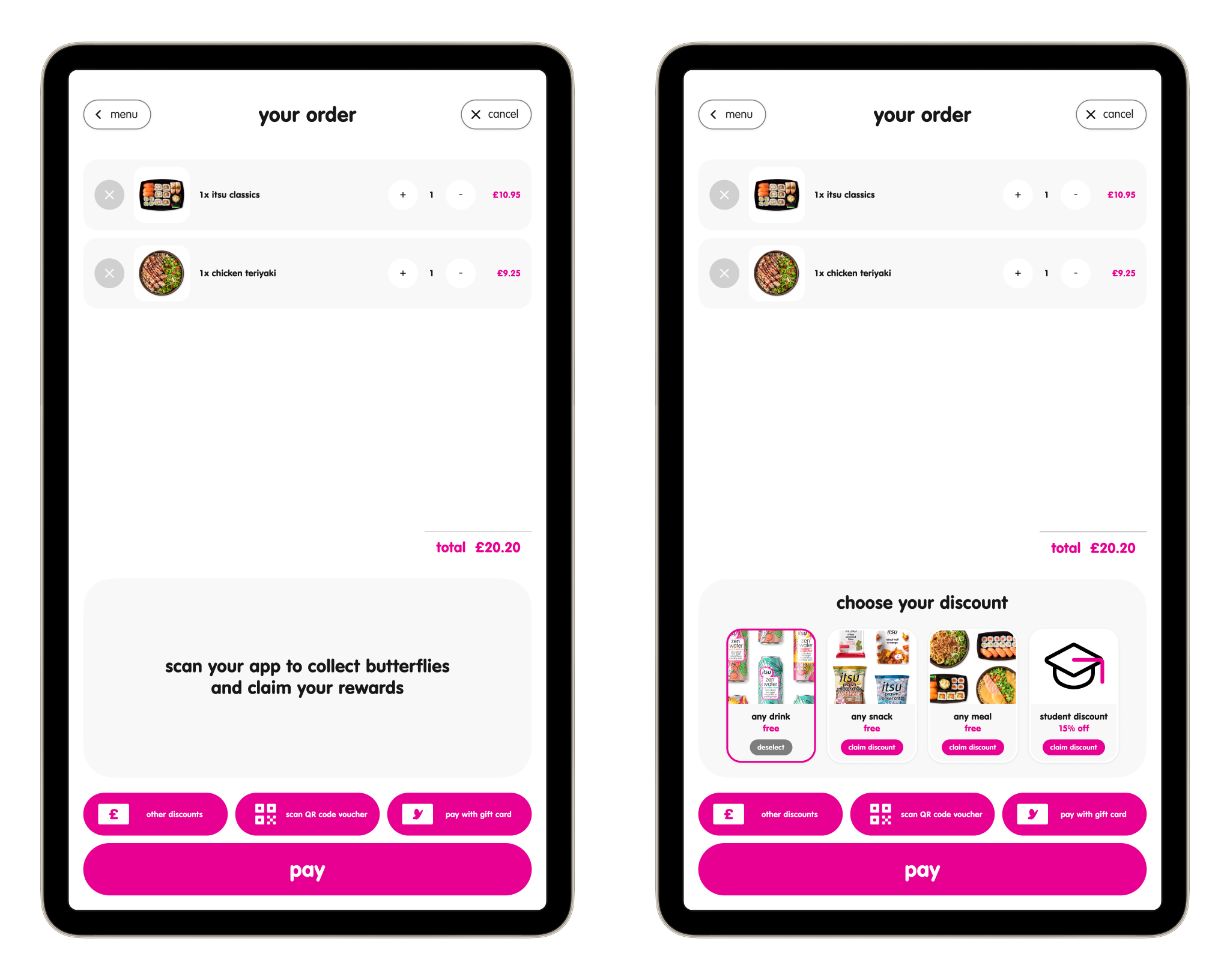
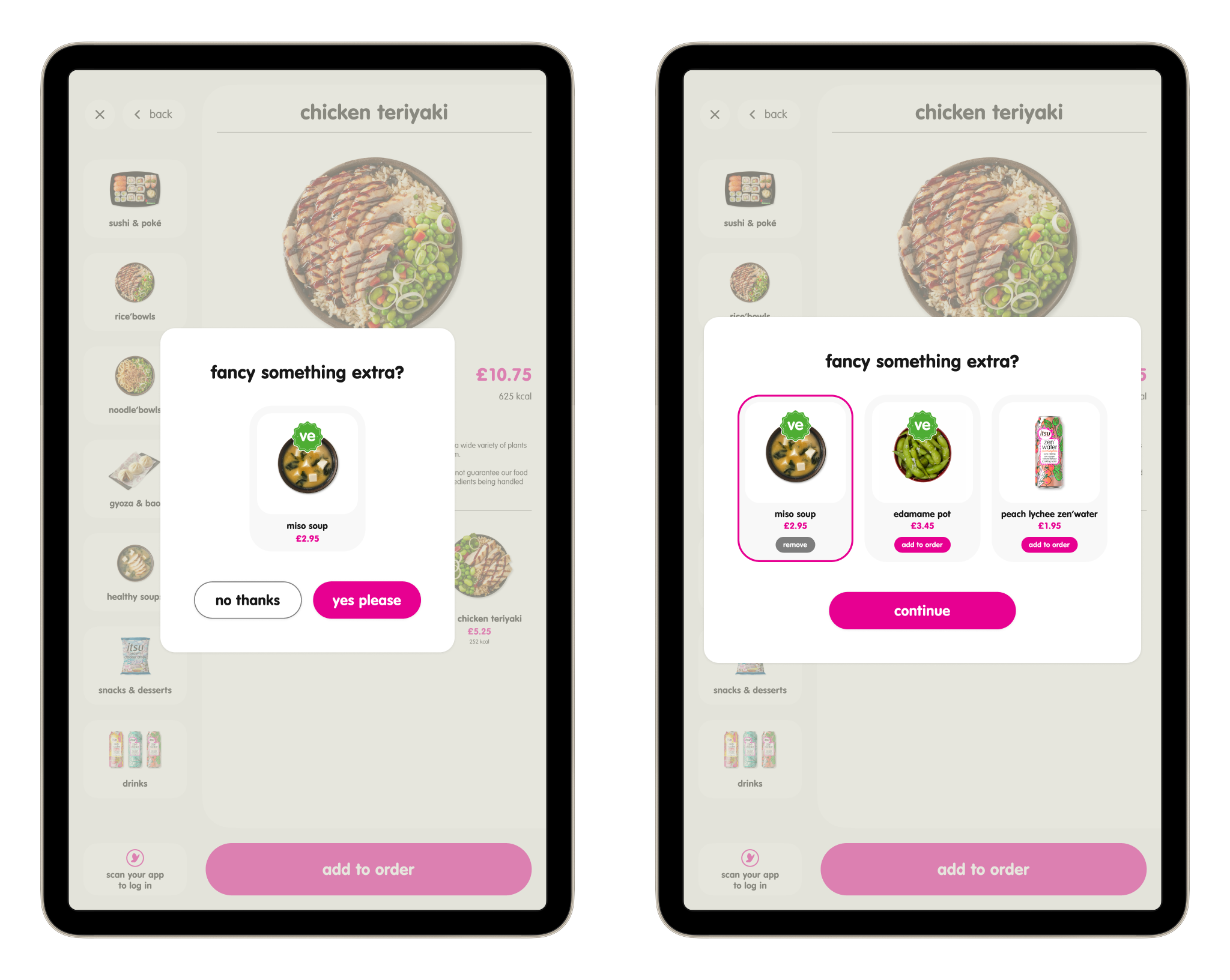
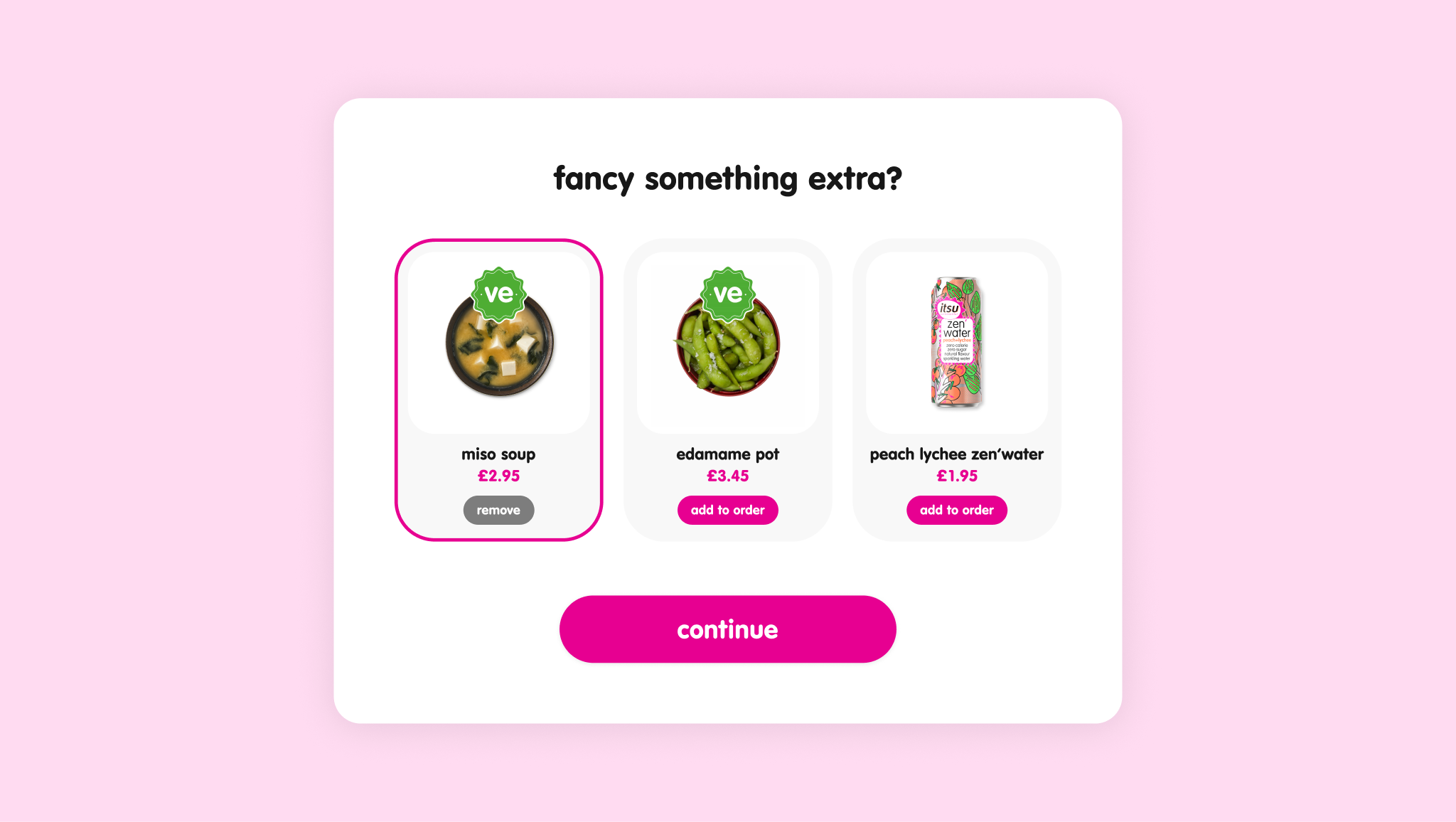
Typical menu page before (left) and after (centre, right). New version features 'nested' product listings, removing the need to scroll. When tapped, nests expand into a full page selector where product variant can be picked.
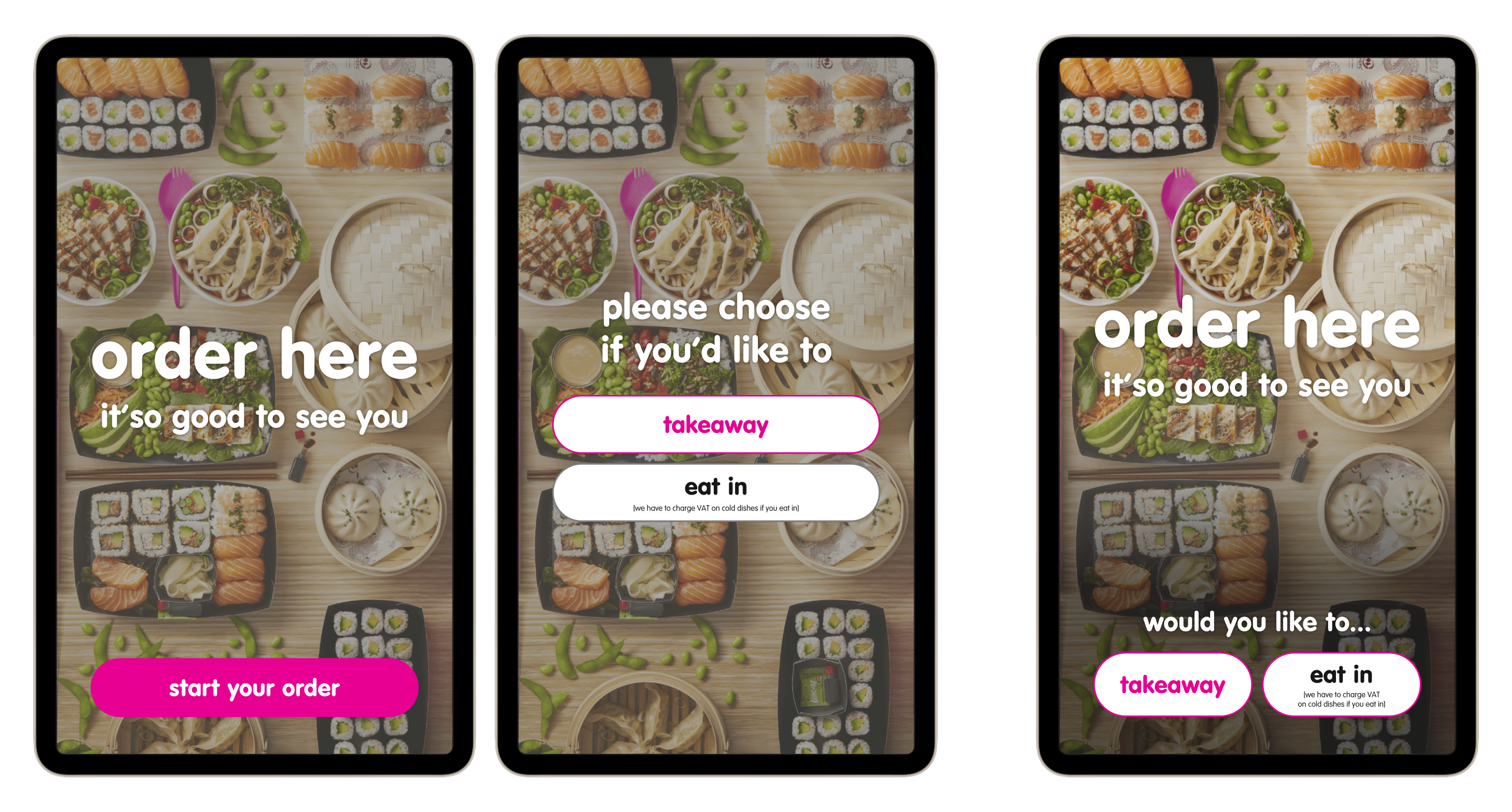
Screensaver/entry flow before (left, centre) and after (right). By combining the screensaver with the dining preference screen, the ordering flow is reduced by one step.
The impact: 10% reduction in dwell time, improving ordering speed and throughput during peak periods.